The UI/UX of your startup or business is the single essential component that can make or break your mobile or web app. If you build your web or app without proper guidelines and principles, it will be left apart and, in the end, deleted from the Play Store. Why? Because your app without UX/UI is nothing but a room without cement. If you are a UI/UX designer, you must be careful while creating a web or app design because one mistake could separate your app or web from the search. From Multiverse Software, you can hire UI/UX designers from Toronto and around the world. Our designers provide the best UI/UX design by using all the essential principles of UI/UX.
What are UI/UX principles?
UI/UX design principles are the usability guidance for the designer to create a design that delights the users. The principles of UI/UX design focus on creating catchy patterns that users can easily understand and use, ensuring a seamless and enjoyable experience for users. If you follow this principle, improve the consistency of your website or mobile app, which provides you with a better experience.
Why are UI/UX design principles important?
These UI/UX design principles are important because they help you create consistency and provide a better experience in your design. Moreover, these principles enhanced the user experience and brand loyalty, lowered the need for ongoing maintenance, and enhanced user satisfaction. Now, let's dive into the five essential UI/UX design principles that will help you in your design trajectory.
5 Essential UI/UX Design Principles
1. Scale of the design, Breakpoints, and Layout/Grid System used in the design
The scale of the design is used in the UI/UX design for better sizing and proportion of the web or app. It tells the relative size of all components that are used to design the web or app, such as buttons, images, text, layout or grid system, and breakpoints. It is crucial for the UI/UX designer because it establishes and balances the hierarchy within the interface design. We will discuss breakpoints and grid systems used in design in detail.
What are breakpoints and their importance in design?
Breakpoints are the specific requirements of the screen sizes of websites or apps. Breakpoint adjusts the web layout automatically according to screen sizes to improve usability and readability on multiple types of devices. It is the central element in the UI/UX responsive design. Moreover, breakpoints help the designers make their websites work properly on multiple devices, like tablets, desktops, and mobile phones.
Break points are significant in UI/UX design because they help you optimize your web or app on multiple screen sizes and devices. If you use breakpoints in your design, you permit the users to use them on any screen size whenever they need them.
What is a layout grid system?
The layout grid is the set of columns and lines that arrange all the elements of your design in an organized way. It is the visual appearance of your design that shows a proper message to the users while using the website. Layout grids have three types that you can choose from design tools (Figma, Adobe XD): column, row, and uniform grids.
Example for layout and grid
For example: Our site at Multiverse Software is a responsive website that uses a column grid to create an attractive visual experience.
At the medium screen size, 3 consistently sized columns made up the grid structure, and elements were aligned to and within these columns. On mobile (small screen size), Our 3-column grid reflowed into a one-column grid structure.

Example for Layout and Grid
2. Visual Hierarchy: For Typography and Colors
Visual hierarchy is the second essential principle of UI/UX design, where you can arrange all elements to create a visual effect. Visually, every page of an app or web page is significant because designers put every element in order. Below, we discuss the two top visual hierarchies that have a significant role in design.

Visual Hierarchy: For typography and colors
What is the color scheme for the design?
A color scheme is used to convey the message, mood, and emotion to users. If you do not use a color scheme wisely, it causes distraction and confusion among users. If you want to use a color scheme wisely for your design, then you have to understand the theory of colors, like color psychology, harmony, and the color wheel. As color psychology indicates, there is an emotional association in the middle of humans. Color harmony shows a style guide for color, such as which colors work together well and give a happy effect. The last color wheel indicates the relationship and how they create various color schemes while mixing them.
How is typography important for UI/UX design?
Typography is a significant element in your visual hierarchy. It is the art of text arrangement technique in your design. It helps you create an aesthetic and readable effect in your content. If you want to use it in your design, you must understand the font color, size, alignment, weight, spacing, and typeface. These elements enhance the engagement of the reader.
3. White Space
White Space is the space around any element in the composition of a design. The space between buttons, paragraphs, different elements, images, and text that appear on the screen of the user is used in the design. It is also a significant principle in the design because it organizes the content, improves legibility and readability, increases user interaction, draws focus on elements, and enhances the visual order. Moreover, the other name for white space is negative space. Sometimes, designers use white space to attain the grace and simplicity of design.
Example for white space
For example: Shopify’s website makes great use of white space to separate sections.

Example of White Space
4. Usability Guidelines: Error Prevention, Feedback, etc.
Usability guidelines are a way for designers to measure how their designs work and are easy to use for users. Through usability guidelines, UI/UX designers can prevent errors in the design by creating proper feedback mechanisms and using error prevention strategies.
Error prevention
We do not like any interruptions whenever we use the web or app because they increase frustration. UI/UX designers use the error prevention method to handle the error prevention issue. At first, designers set up an alert system on the web or app so that whoever is using it is notified as a reminder to prevent future problems. Second, set up a suggestion system that guides users to avoid common mistakes. Last, add a confirming action in the design whenever the user wants to make changes, a confirmation message will show on the screen.
Example of error prevention
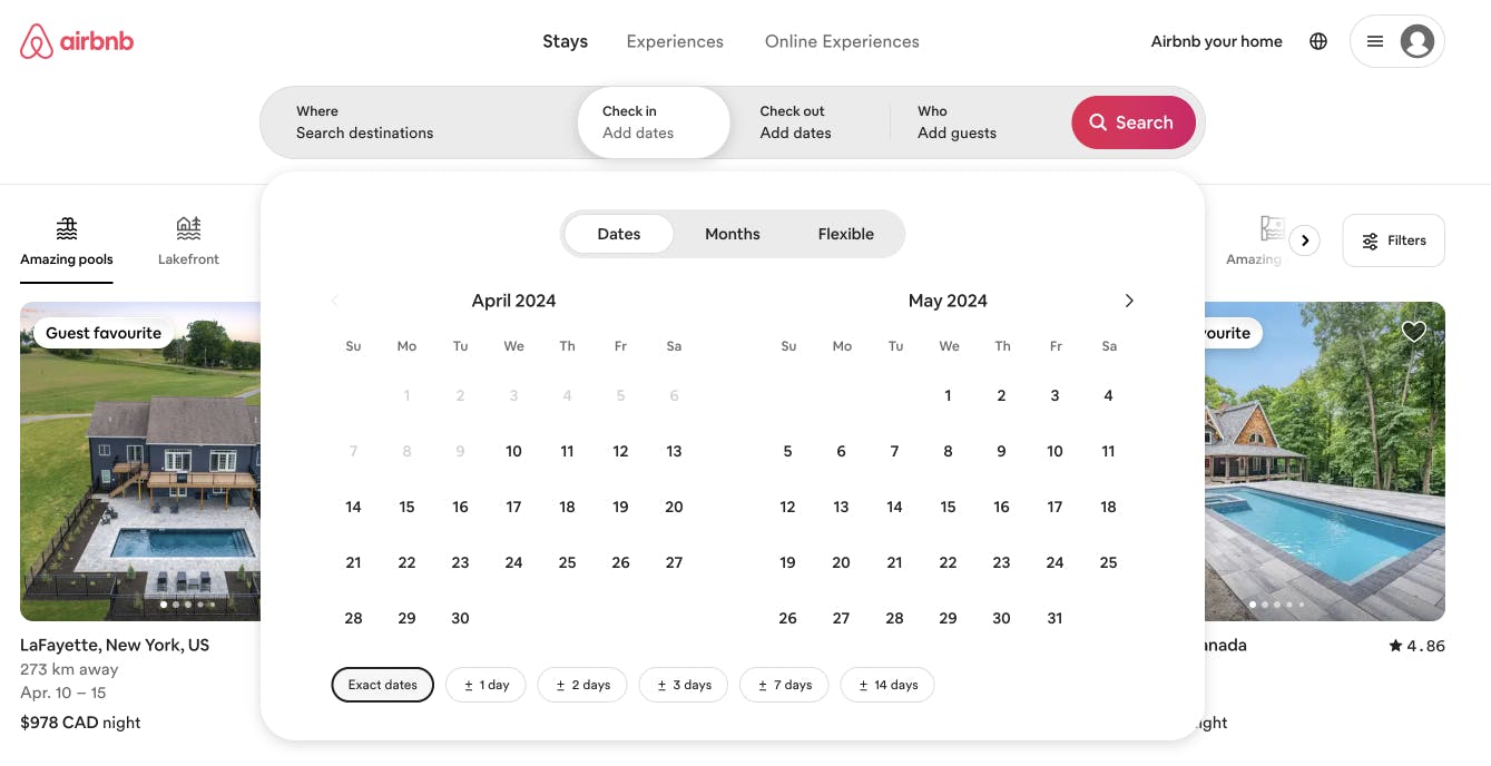
For example: Airbnb disabled all dates before the current date to prevent users from selecting a past date.
If users aren’t limited in the dates they can choose, they may accidentally select a date that cannot be booked. A helpful constraint here will force users to pick a date range that fits.

Example of Error Prevention
Feedback mechanism
If you set feedback mechanisms in your web or app, it helps users to use it with more comfort and ease. Feedback is categorized into three basic types.
Possibility feedback
This type of feedback helps guide users throughout the journey while visiting the website or app. For example, when a user visits a grocery or clothing website, a notification appears to “Add in a Cart.”.
Action feedback
This feedback enhances the experiences of users by providing a confirmation task. For instance, when users submit the form or complete the task, the “Thank You" message pops up.
Empowering Feedback
It empowers the users by telling them where they are in a specific area of the app or system. For example, when users shop on the websites, it shows keywords like earbuds and accessories.
Example for feedback
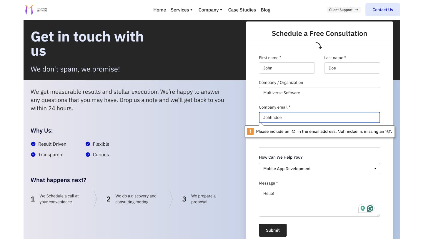
For Example, Our site at Multiverse Software has a form to submit inquiries.
To adhere to these guidelines & a better experience, we have feedback methods in place, such as when a user has an error in the form we do not allow them to submit and let the user know where is the error & what is the error so they can resolve it.

Example for Feedack
5. Consistency: Using componentized elements throughout
Design consistency is the most crucial step in all the steps between UI/UX principles. It is necessary to maintain the consistency of the design that users love. For instance, some design components need consistency throughout the design. Every aspect of principles, including typography, color scheme, layout, buttons, icons, user flow, and navigation, need consistency. If a UI/UX design does not maintain consistency, it loses the interest of users, and as a result, they abandon the website. With consistency in UI/UX design, designers increase accessibility and usability, higher brand recognition, and even lower cost. You can use heat maps to analyze the interaction of users, check the area of inconsistency, and recover it.
6. Good to have; accessibility guidelines
It is good to use accessibility guidelines for content for readability for users. You can use color contrast, implement responsive design, provide feedback and error handling, and create inclusive forms to interact with users. Accessibility is used for the satisfaction of customers and the growth of business. If you make your app or web accessible for users, it increases the number of people on your site.
Example for accessibility
BBC made huge strides by making their sites accessible for visual impairment.

Example for Accessibility
Here is why Multiverse Software is the best UX/UI design partner
At Multiverse App, our UI/UX designer in Toronto understands the critical role that UI/UX design principles play in the success of any digital product or service. Here are some eye-opening statistics that highlight the significance of UI/UX design:

Here is why Multiverse Software is the best UI/UX design partner
User-centric approach at Multiverse Software
Over 88% of online consumers are less likely to return to a website after a bad user experience. However, at Multiverse Software, we put users at the forefront of our design process, conducting in-depth user research and analysis to gain insights into their needs, behaviors, and preferences. We create tailor-made designs that resonate with your users and drive positive experiences by understanding your target audience. Over 88% of online consumers are less likely to return to a website after a bad user experience.
Intuitive design for seamless UI/UX
70% of users abandon mobile apps due to poor design and user experience. We focus on crafting intuitive user interfaces that guide users effortlessly through your app or website. Our design solutions prioritize ease of use, clear information architecture, and intuitive navigation, ensuring users can easily find what they need and accomplish their goals.
Visually stunning design to enhance UI/UX
Nearly 95% of users indicate that a positive user experience is the most significant factor for an app. At Multiverse Software, UI/UX designers possess a keen eye for aesthetics, creating visually stunning designs that align with your brand identity. From selecting the correct color schemes to designing visually appealing graphics and typography, we create captivating visual experiences that leave a lasting impression.
Mobile-friendly design for enhanced user engagement
Investing in the user experience yields an average return of $100 for medium businesses. Our team excels at creating mobile-friendly interfaces that provide seamless experiences across various screen sizes and platforms. We optimize your app or website to perform flawlessly on mobile, enhancing engagement and user satisfaction.
Conclusion
In conclusion, UI/UX principles are crucial for any design that leads to the success of a website or app. After reading this guide, you will be able to use these principles in your design. In other words, for designers, this guide is a great help. If you are looking for a UI/UX designer in Toronto, then Multiverse Software Agency can help you complete your dream project. We have professional UI/UX designers on our team; they design websites or apps based on these principles.


